Most entrepreneurs know what a pitch deck is – a presentation that a startup puts together to pitch their business to potential investors. It sounds simple, but it’s easy to become immediately confused about which pitch deck slides should be included and what information should be added.
An investor pitch deck is not meant to be lengthy and exhausting, and sometimes, this can be a challenge. It’s not meant to explain every detail of your business or answer every question a potential investor may have. Instead, it’s meant to introduce your business and to drive interest; initiating relationships that can lead to investment.
Knowing what information not to introduce is just as important as knowing what information to add to your deck.
We’ve helped hundreds of startups create and design their pitch decks, and we want to help you too. In this post, we will introduce you to the nine most important pitch deck slides that you need to focus on and give you several examples that you can learn from!
Without further ado, here are the nine slides you must include in your deck to maximize your chances of fundraising success.
1) Title/Cover
The first pitch deck slide you should add to your presentation is a title slide. You’d be surprised at the impact that a simple title slide adds to your pitch. They say that you only get one chance to make a great first impression, and when you pitch your startup, your title slide is that immediate first impression opportunity.
Before you even open your mouth to deliver the first word of your pitch, this initial pitch deck slide will set the tone for investors. If your tagline is underwhelming, it may immediately turn off the investor. If your logo is boring, it may give investors the immediate perception that your business is boring as well. It is important to set the stage for a great pitch, and this begins with a strong pitch deck slide.
This title slide that was displayed in Mint.com’s pitch deck is over a decade old, but there’s a reason why it’s one of the best pitch decks out there. It’s designed well but minimally, using white space to draw the viewer’s eye directly to the logo. The tagline “Take Back Your Wallet” is presented in all caps, driving in Mint’s message the moment the slide is opened.
The title slide for We Are Onyx is more involved, but equally effective. Like Mint, they added a strong tagline that allows the audience to immediately gain context of the business. Additionally, they added in strong imagery of their products to further draw in the attention of viewers.
Here are a few things you can learn from these pitch deck slides:
- Don’t over design it. Use white space and minimalism to draw the eye to the most important part of the slide – the logo and the tagline. If you include product images, make sure that they are professional images that make the slide more impactful.
- Include a strong and memorable tagline that quickly introduces viewers to your concept and allows them to immediately connect with your pitch.
- If you will be introducing presenters during the pitch, we recommend including the names of all presenters on this slide. This allows the audience to connect with each team member as they introduce themselves.
2) Customer Problem
Start your pitch strong by showcasing the problem or problems that your solution will address. Your product or service should exist to solve a real market problem. Explaining the extent of the customer problem early on sets the stage for the rest of the pitch deck – especially when you begin describing why your startup is perfect for solving these challenges.
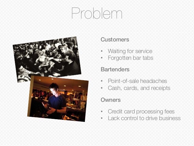
This Customer Problem slide from FlowTab’s pitch deck showcases all the necessary requirements of a great problem slide. It outlines who the users are in bold lettering – customers, bartenders, and owners. It also briefly explains the challenges faced by each of these user groups.Furthermore, the slide is clean and minimally designed with few words and a couple supporting images. Pitch deck slides don’t need to be overwhelming to stand out – they just need to present the right information in the right way.
Here are a few things you can learn from this pitch deck slide:
- Identify your market immediately. Not everyone will face the same challenges, so be sure to identify which challenges are relevant to each customer group.
- Be creative. You don’t have to add a title to every slide or stick to bullet points to organize information. Find creative ways to deliver your message, whether it’s by adding imagery, animation, or other creative methods.
- Use lettering wisely. Bold fonts, font colors and even text positioning can add to or take away from the impact of your message. Use the proper text elements to keep your pitch and pitch deck interesting.
3) The Solution
At this point in your pitch, your audience should know what target market you serve and should be familiar with the challenges that they face. Now is a good time to introduce the solution – your product, service, or business. Of all the pitch deck slides, this slide may arguably be the most important. However, this slide on its own is ineffective. Without a challenge, a decent-sized market, and a plan to reach them, the solution itself is irrelevant.
Design the best Solution slide, but make sure that presenting an awesome product isn’t your only goal. Presenting an awesome product that effectively solves a challenge for a wide market of consumers who are ready to pay for it – that is the goal.
Introduce your product and show how it solves the customer’s challenge. Showcase the features that make it stand out. This is a slide where graphics really matter – pictures speak a thousand words and showcasing an image, wireframe, or 3D model will make this slide exponentially more impactful.
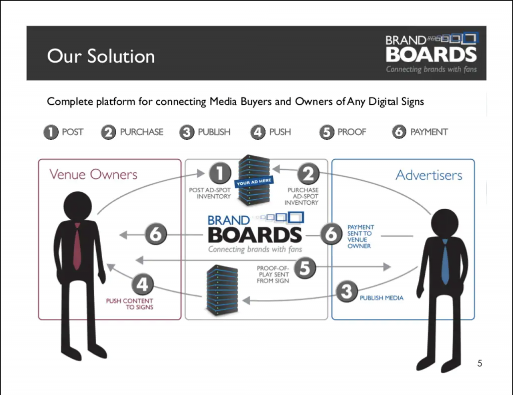
Pitch deck slides should be simple but informative, and that’s exactly what Brand Boards achieved with their Solution slide. Using great imagery and little text, Brand Boards was able to show exactly how their solution allows venue owners and advertisers to connect and set up ad campaigns using digital signage. A simple-to-follow graphic allows the audience to easily understand what the product is and how it works, all in a single slide.
The best part of the graphic is that it separates each customer type into their own boxes on the outside and places the solution in the middle. This tactic makes it easy to understand where the solution fits into the equation between the two customer groups.
Yaydoo took an awesome and creative approach with their Solution slide. Instead of using boring bullet points, they added well-placed text and a simple image. The tagline, “Your office on autopilot™” sums up the entire solution in four words while “e-Procurement and AI for your workplace needs” quickly describes the solution that is being offered.
Furthermore, the graphic is well done and shows how five different challenges faced by “Your Company” are solved simply by inserting the Yaydoo solution into the process. Again, placing your solution in the middle to showcase how a customer’s problem is solved is always an effective method.
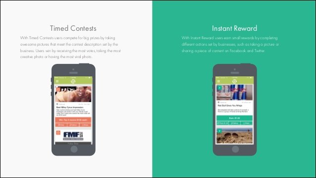
This Solution slide from Daily Hundred uses several graphical elements to showcase its product. The split-screen makes it immediately known that two separate features are being displayed. Bolded header font allows the audience to understand what the feature is, before reading further into the detailed text. Usage of phone mockups provides a visual showcase of the solution and keeps the audience’s mind from guessing.
Here are a few things you can learn from these pitch deck slides:
- Use strong graphics to show how your solution solves the problem. Ideally, showcase the problem on one side, the customer on the other, and the solution in the middle; explaining how each entity benefits from the other.
- Use mockups and models to show exactly what your solution looks like – a picture can speak a thousand words if done correctly.
- Show images or blueprints of your solution. Text is limited. If you don’t show the audience what it is and what it looks like, they will guess – and they will probably guess incorrectly!
4) Unique Selling Proposition
This is the pitch deck slide that shows why your startup is special. What do you provide that no one else can provide? Just because your business solves a problem, doesn’t mean that you are the only business solving that problem, or even that your solution is any different from any other solution that already exists. In other words, what’s your special sauce?
Backstartup uses graphics to showcase its unique selling proposition. The title, “We are not a traditional service” makes it known immediately that they are providing something different and something better. The graphics clarify it’s services – accountants, lawyers, and technology – and explains what unique features they provide to help their users reach a specific goal.
Lexyom uses their USP or “Our Edge” slide to show that they have the keys to unlocking their customer’s challenges. Their slide shows the exact formula of advantages that give them an edge over other competitors in the market.
Here are three things you can learn from these pitch deck slides:
- Knowing what makes you special also means knowing what makes your competitors special. Do a competitive analysis first and examine your solution’s position in the market.
- Use creativity to display exactly how your advantages help your customers reach their specific goal.
- Think about factors that create a barrier to entry for other businesses. Real advantages can’t be easily duplicated by another competitor.
5) Target Market & Market Size
Investors don’t just want to know that you are solving a problem, they also want to know that you are solving a problem for a large market of customers. In this slide, showcase the market research that you have found to display how large your market is either by the number of consumers or revenue.
Orchard does a good job projecting market size in its pitch deck slides. Using a TAM/SAM/SOM analysis, they are able to easily display how large the total market is, and what portion of that market they can realistically target. Furthermore, they strengthened the slide by providing a quote from a trusted market source that further validates their business approach.
Owlr used their Market Size slide to showcase how many consumers exist in their market and how much that market is worth. This helps investors identify the earning potential and confirms that the market is large enough for the business to earn a considerable share and a profitable position.
PinMyPet used awesome graphics elements for their pitch deck slides. By implementing large, colorful, and minimal text, they were able to showcase exactly how many users are in their market (in this case, dogs and cats) and how much the entire market is worth in terms of revenue. Furthermore, they added their target regions and aligned their market numbers to the specific regions where they will offer their products.
Here are a few things you can learn from these pitch deck slides:
- Use a TAM, SAM, SOM analysis to showcase the size of your market. This helps investors understand both the total market, as well as the portion of that market that your business can realistically serve.
- Use statistics that are extremely relevant to your business. If you’re serving a particular region, find the market size for that particular region. Global statistics are great, but only if you are serving a global audience!
- Make sure you know where your numbers are coming from. Be able to cite them if necessary – it probably will be.
6) Business Model
It’s not always clear how a new startup earns money, and if it’s one thing investors care about, it’s how a startup earns money.
Use this slide to explain your business model and showcase how revenue is generated. This is especially important for marketplace solutions where the startup earns a fee from transactions between two parties.
Open Door showcases its income streams clearly in this Business Model slide. As shown, they charge 15% of rents, which is equal to around $200/month for each resident.
Reflect also clearly states how their revenue is earned. Each session grosses approximately $95. Of this, Reflect earns $15 per session as a transaction fee.
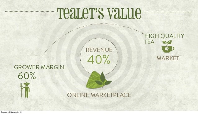
Tealet’s slide shows how revenue is made for both the Company and for the tea grower. Simply stated, for each sale, the grower retains 60% of the margin while 40% is retained by the platform as a transaction fee.
Here are a few things you can learn from these pitch deck slides:
- If your startup mostly sells one product or service with a general price, showcase that price. If you offer several products or services, showcase pricing from a handful of your top products.
- Show at what part of the process revenue is earned. For example, in a marketplace type scenario, revenue is typically earned after the product/service has been delivered.
- For marketplace applications, show how revenue is shared between parties and what portion of sales will be retained by the startup.
7) Founder/Team
Simply put, the team slide introduces your team and proves why your founders and managers are the right people to introduce and run the Company.
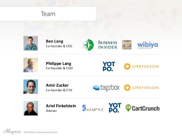
In their pitch deck, Mapme introduced its three founders and one advisor in a single slide. Instead of crunching a ton of text to describe each person’s background, they simply added logos of companies that each member had been involved with in the past.
Manpacks had seven people to introduce, which is impossible to do in a single slide if you’re going to write a biography about each. Instead, they used bullet points to detail specific items about their founders and used logos to summarize the backgrounds of their advisors. Each person is shown with a headshot image, but the shapes of the headshots are different; providing a subtle hint to which individuals are team members and which are advisors.
Here are a few things you can learn from these pitch deck slides:
- Minimize text by using logos to showcase each member’s experience and background.
- Use headshots to introduce each member. They don’t have to necessarily be professional headshots, but they should be clear and high resolution – and it helps if everyone is smiling!
- Focus on the most important attributes of your background. You don’t need to detail every accomplishment you’ve ever made, only the few that are most relevant to your position in the business.
8) Traction
Investors don’t just want to hear about what you’re going to do. What’s equally as important is what you’ve already done. Use this slide to describe the milestones you’ve already reached – user growth, survey results, known brands you’ve worked with, and etc. This pitch deck slide is a major selling point, and it is important to offer up the numbers and metrics that showcase the strength of your business, validate all assumptions, and prove that there is a market of individuals ready to use your solution.
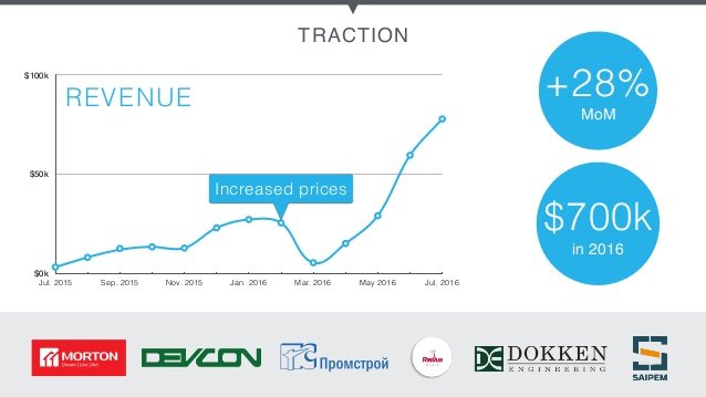
TraceAir used several visuals to display traction in their pitch deck slides. First, they provide a line graph showing the growth of revenue and also displaying how a price increase led to an exponential increase. Then, they provide several positive metrics including average Month-on-Month growth and annual revenue. Finally, they build credibility by showcasing the logos of several well-known clients that they have worked with.
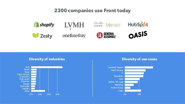
Front led their slide with a strong milestone statement – “2300 companies use Front today.” This statement hammers down the fact that there is a validated market, that the Company knows how to acquire new customers, and that at least 2,300 corporate decision-makers thought they were worth giving a try. Like TraceAir, they showcased their well-known clients using logos; immediately qualifying them as a real contending solution. Finally, they showcase metrics of their client base by showing which portion of customers are from each target industry and the diversity of use-cases.
Daily Hundred used their Traction slide to show how well they have been able to perform over a three-month launch period. While they did not mention revenues earned during this period, they were able to prove their case by showing large user growth, user engagements, and positive user experience.
Here are a few things you can learn from these pitch deck slides:
- Make sure you have traction to show. A startup without traction is just an idea. If you don’t have any numbers to show yet, launch a minimal viable product and get some early adopters using it.
- Revenue isn’t everything. Money talks, but it’s not the only metric that’s important. Metrics like user growth, engagement, and retention are also strong indicators that can validate your assumptions and prove your case to investors.
- Use graphs to showcase growth. Graphs are strong visuals and when you can connect growth to certain events, it shows that you know how to effectively progress the business.
9) Financial Ask
You’re pitching because you want to raise money. The investors are listening to your pitch because they want to invest money. This slide gets to the meat of things – how much investment you’re seeking.
In this slide, explain the investment opportunity. You can include how much you’re intending to raise, how the investment will be spent, how much equity is being offered, and even information about funding that has already been raised (if applicable).
Daily Hundred used this slide to let investors know exactly how much money they were seeking to raise. Additionally, they added their preferred method of receiving that money – in exchange for preferred stock.
Kickfolio kept things simple by displaying how much money they are raising during this round, and how much has already been committed.
Swerve added an extra element into their Financial Ask slide. In addition to their target raise of $750k, they also detailed where the money would be spent and how it would be used to spur the next level of growth.
Here are a few things you can learn from these pitch deck slides:
- Be realistic about what you’re asking for. Investors are usually analytical and if you’re asking for a certain amount, you better be ready to prove why you are worth it. Calculate your startup valuation and use that valuation to assess how much you should raise and what level of equity you should offer.
- Don’t raise money just because it’s available, raise it to grow your business and know exactly why you are raising it. Even if you don’t show what the money is going to be used for in your pitch deck slides, the question will be raised at some point.
- Mention previous funding raised and other investors who have invested. Risk doesn’t seem as risky when someone else is already on board. This creates FOMO, and you want investors to leave the pitch feeling that they’d be missing out on something major if they don’t invest!
Designing Your Pitch Deck Slides
Pitch decks weren’t meant to be extremely difficult to create, but there are elements that must go into your deck to maximize your chances of securing the seed money you need to build and launch your solution. As you send your pitch deck around and receive feedback from investors, continually adapt your presentation until it is perfect.
As always, our team at ThinkLions is here to help. If you need assistance creating your pitch deck, our pitch deck designers and consultants are ready to work with you. Check out one of our sample pitch decks and contact us today!


